Lincoln Tech’s WorkforceLinc helps build teams of industry-leading technicians. They recruit candidates for industry partners and offer training tools and certification assistance to help upskill current workforces.
My Role
Logo Design
Branding
Web Design
Project Goals
WorkforceLinc needed a logo that maintained a visual connection to the Lincoln Tech brand, either by incorporating its signature red or adopting a similar look and feel. The goal was to create a fresh, modern, and engaging identity. Once the logo was completed, I designed a website that provided employers with a seamless way to explore the program’s offerings in detail.
Work done with Sussman Creative.


Logo Design
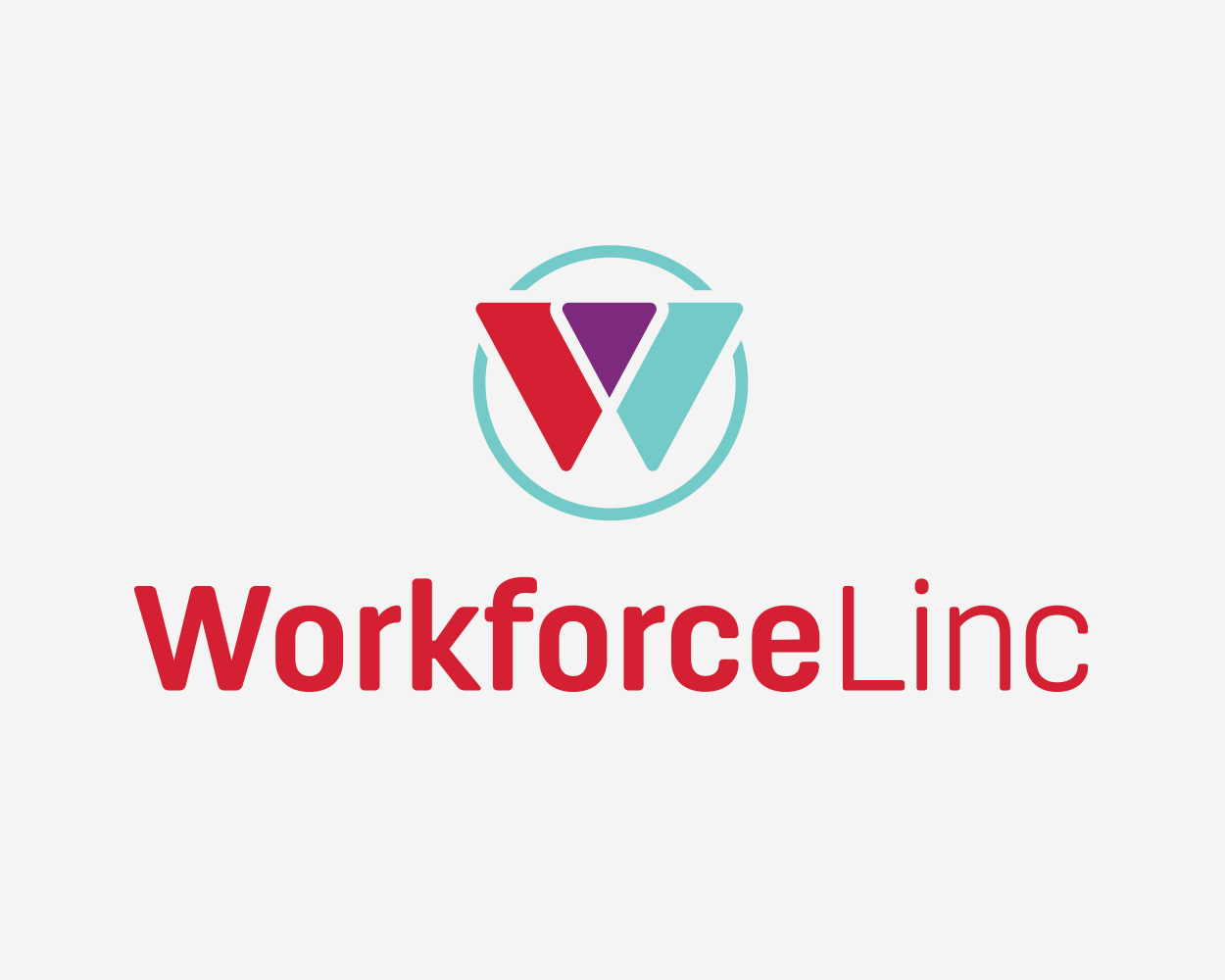
The logo design process began with sketches and black-and-white concepts. After refining several options, I added in color, ultimately selecting teal and purple to complement Lincoln Tech’s signature red. The final logo is available in both horizontal and stacked formats for versatility. The “W” in the design symbolizes the connection between Lincoln Tech graduates and employers – the “linc” that brings them together.


Website Design
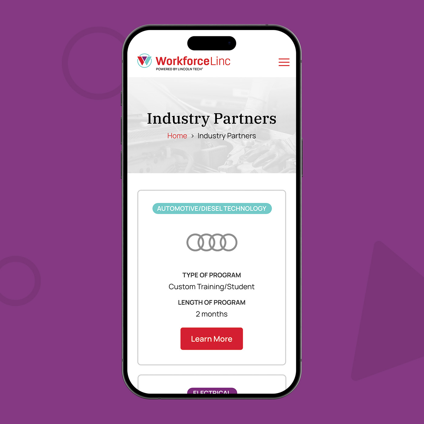
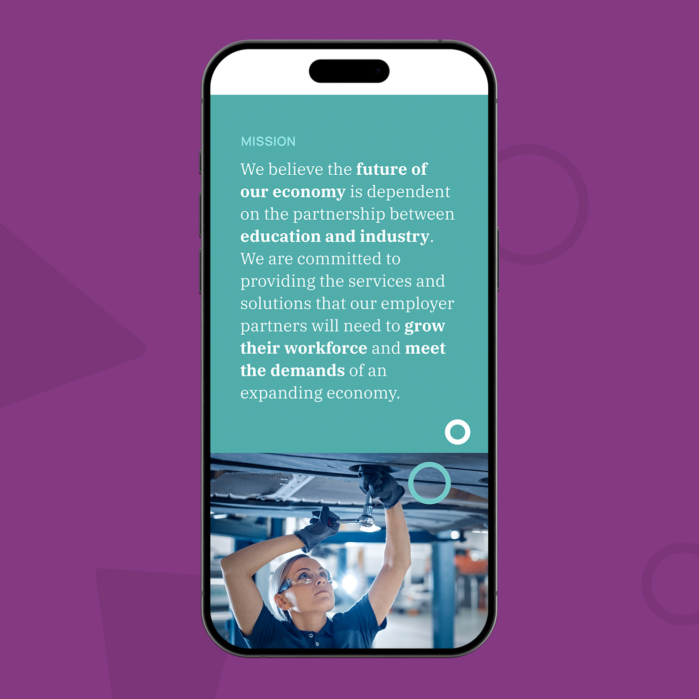
The WorkforceLinc website makes it easy for employers to learn about the mission statement and explore the program’s offerings in detail. I used a clean, intuitive layout to ensure seamless navigation, and engaging content with icons highlights the benefits of partnering with WorkforceLinc. The responsive design provides a smooth experience across all devices, so prospective partners can access key information easily. I added subtle parallax animations throughout to add interest.
